
Chocolate Week is in October, and despite our frequent attempts to keep our weight down in the office, we are always thankful when presented with tins of chocolate and packs of biscuits.
Health Benefits

The nutritious flavanols found in chocolate helps to dilate your vessels, which gives a better blood flow. It also contains magnesium. Magnesium is the fourth most abundant mineral in the body and is essential to maintain healthy and strong bones, normal muscle, and nerve function. It helps keeps your heart rhythmically beating, your immune system functioning, and your blood pressure regulated. It helps to decrease stress and release happy hormones such as serotonin and endorphins as well as a natural dose of caffeine for energy.
Colour Therapy

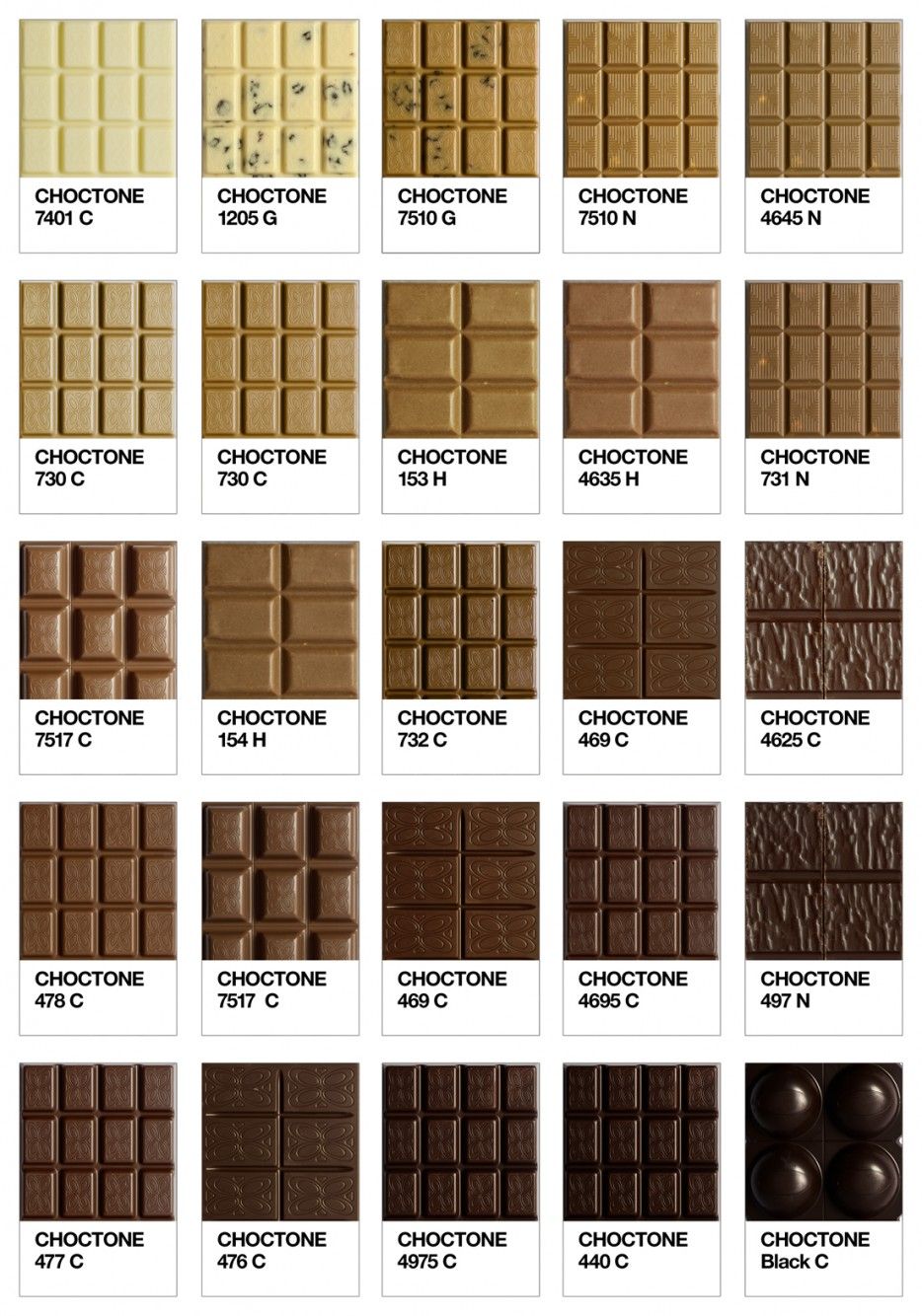
As creatives and printers we take inspiration from most things around us… and that includes CHOCOLATE. I mean have you ever eaten some chocolate and felt inspired?
According to a colour psychologist, brown is a natural colour that evokes a sense of strength and reliability. It’s often seen as solid, much like the earth, and it’s a colour often associated with resilience, dependability, security, and safety.
Using a range of Brown shades down to Nude colours in your design can add warmth, comfort and security and in some sectors are seen as less harsh than using black, adding sophistication.
Brand Marketing
One way in which Brown has developed a positive association is through food. Hot Chocolate is a good example of how warmth, comfort, balance and homeliness can easily become tied to the colour brown.

Colour plays an important part in the psychology of marketing and branding and can influence people’s perception of a brand’s personality. It’s more important to pick a colour that supports the personality of your brand than it is to try to instil certain feelings in potential customers, since everyone has different experiences and opinions.
Popular brands that use brown in their logos and marketing include UPS, Hershey’s, Cotton, Edy’s, J.P. Morgan, and M&Ms.

Brown may not seem to be the most obvious choice but if you have read this far, hopefully, we have started to convince you! We know it may not seem to be the most glamorous of colours, but it can still serve a great purpose in design. It’s a completely natural colour, and it’s association with wood, soil, human hair colour, eye colour and skin pigmentation can be used in a variety of sectors. It is commonly applied as a background colour or texture. When used intelligently, brown gives the impression of reliability, durability, and friendship.
So in summary. As obsessions go, chocolate really isn’t THAT bad, as well as being good for your health, it can also inspire great design and print. So the next time you are thinking of your page layouts or refreshing your design, why not include a little bit of brown to help communicate your message.